Salesio: Simplifying the manual work in fashion retail saving 2.5 hours everyday
Role:
Sole Product Designer
Timeline:
Sep - Nov 2024
Industry/Org:
B2B SaaS in Retail
Scope of Work
UX research, Design System, Branding, and Prototyping

01 project overview
Designed an end-to-end B2B sales dashboard for a fashion retailer in Ulaanbaatar, covering information architecture, data viz, and full brand identity.
Problem Identification
The store's sales reporting process was completely manual by hand. The process was slow, error-prone, and slightly out of date. It led to overstocking or understocking and takes several hours each week just to read the data.
Solution
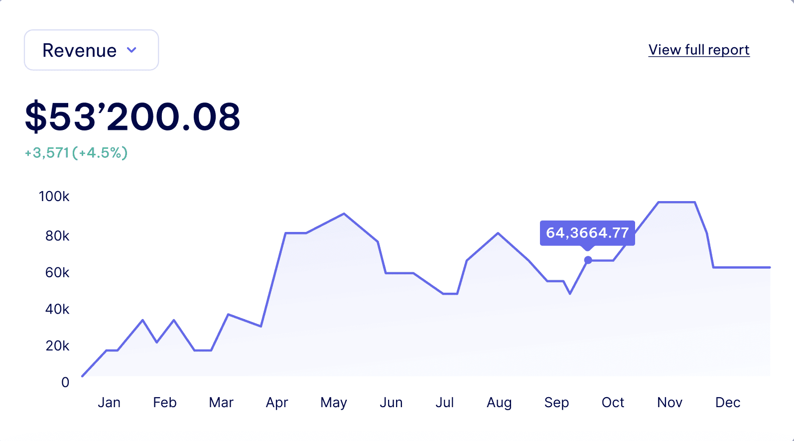
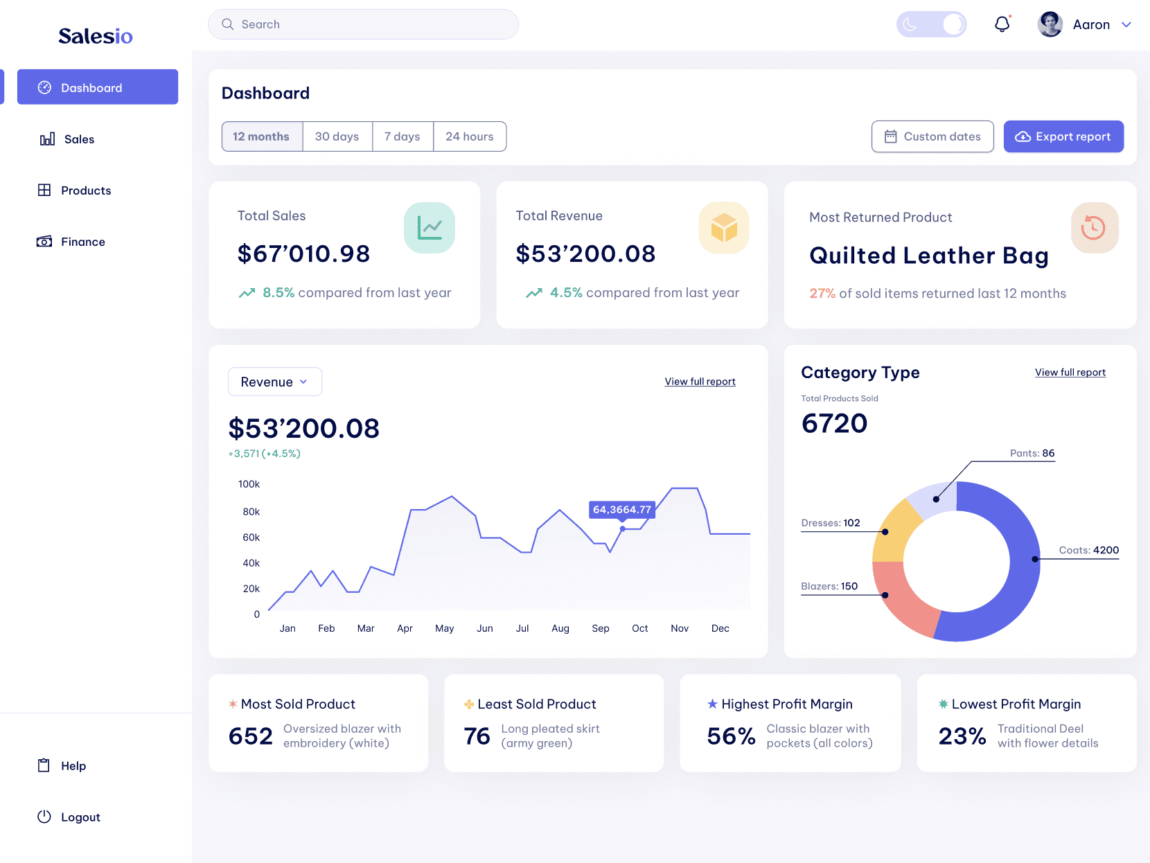
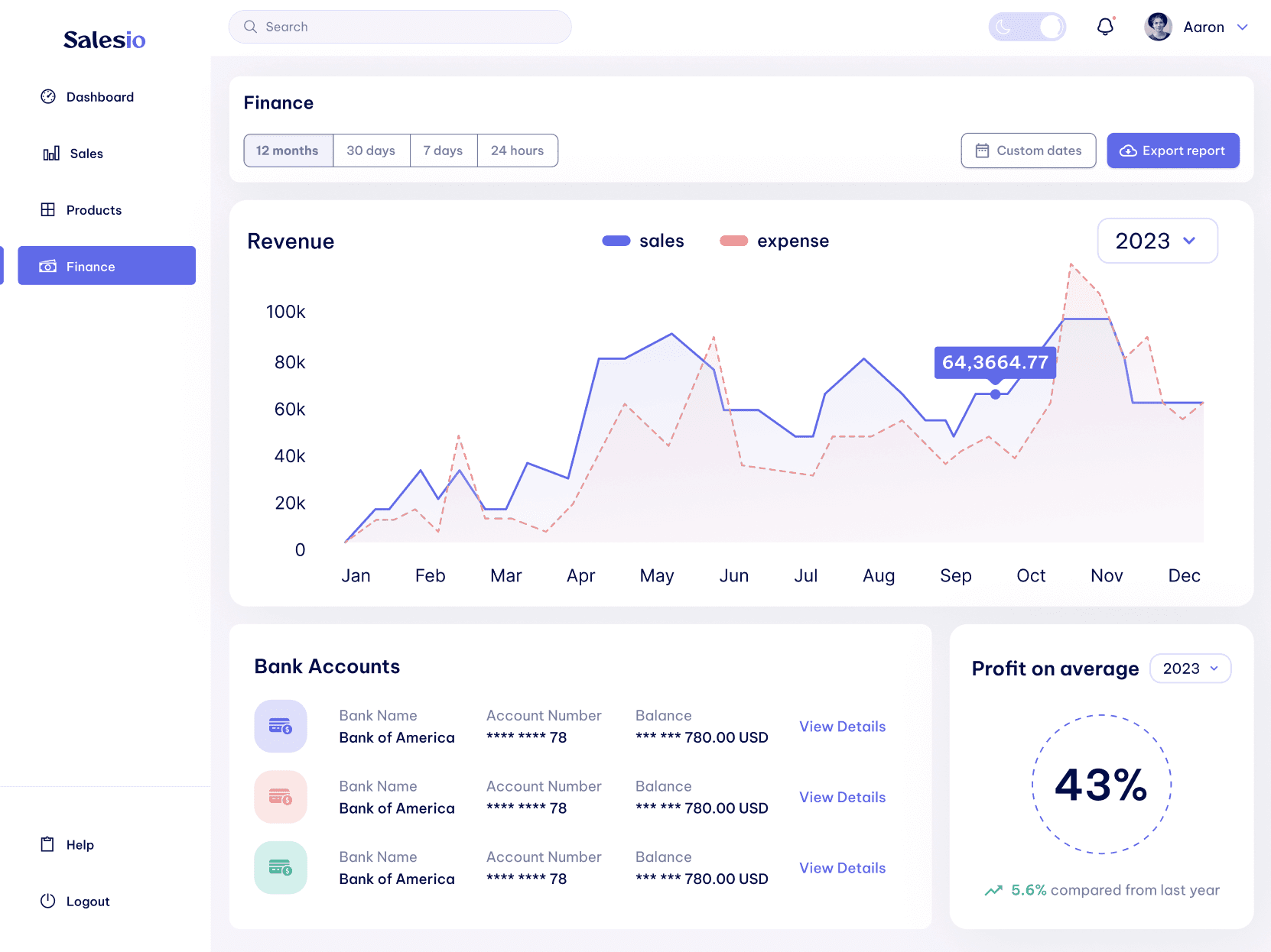
An interactive dashboard organized around the four questions the store manager needed to be answered every day: how's the business performing overall, what sold, what needs restocking, and where is the margin?
02 analyzing current flow
From the existing workflow, the pain points were mostly related to redundancy, confusion, and delay in product stocking, and manual work in data analysis.
By collaborating with the store manager,
Worked directly with the store manager to sketch out what information she needed access to and in what order of priority. Her input shaped the dashboard hierarchy more than any design framework did.
Why my background mattered here:
I came into this project with a business and analytical background, which meant I could read the store's existing workflow not just as a UX problem but as an operational one.


03 UX approach
Translated complex sales data into a clear, scannable reporting view by prioritizing the metrics that drive decisions and cutting everything that creates noise.

04 Design system
Built one design system with UI components that work in both light and dark mode
Adding on the brand identity and logo,
Built Salesio's visual identity from scratch: logo, typography, and a color system designed to work across both light and dark modes without creating two separate design systems.


05 final decisions
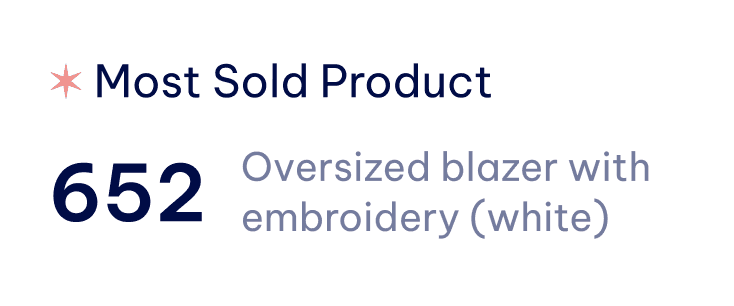
Early versions showed 12+ metrics on the main dashboard. After stakeholder review, we cut to 5 primary KPIs.
Dashboard + Sales Reporting
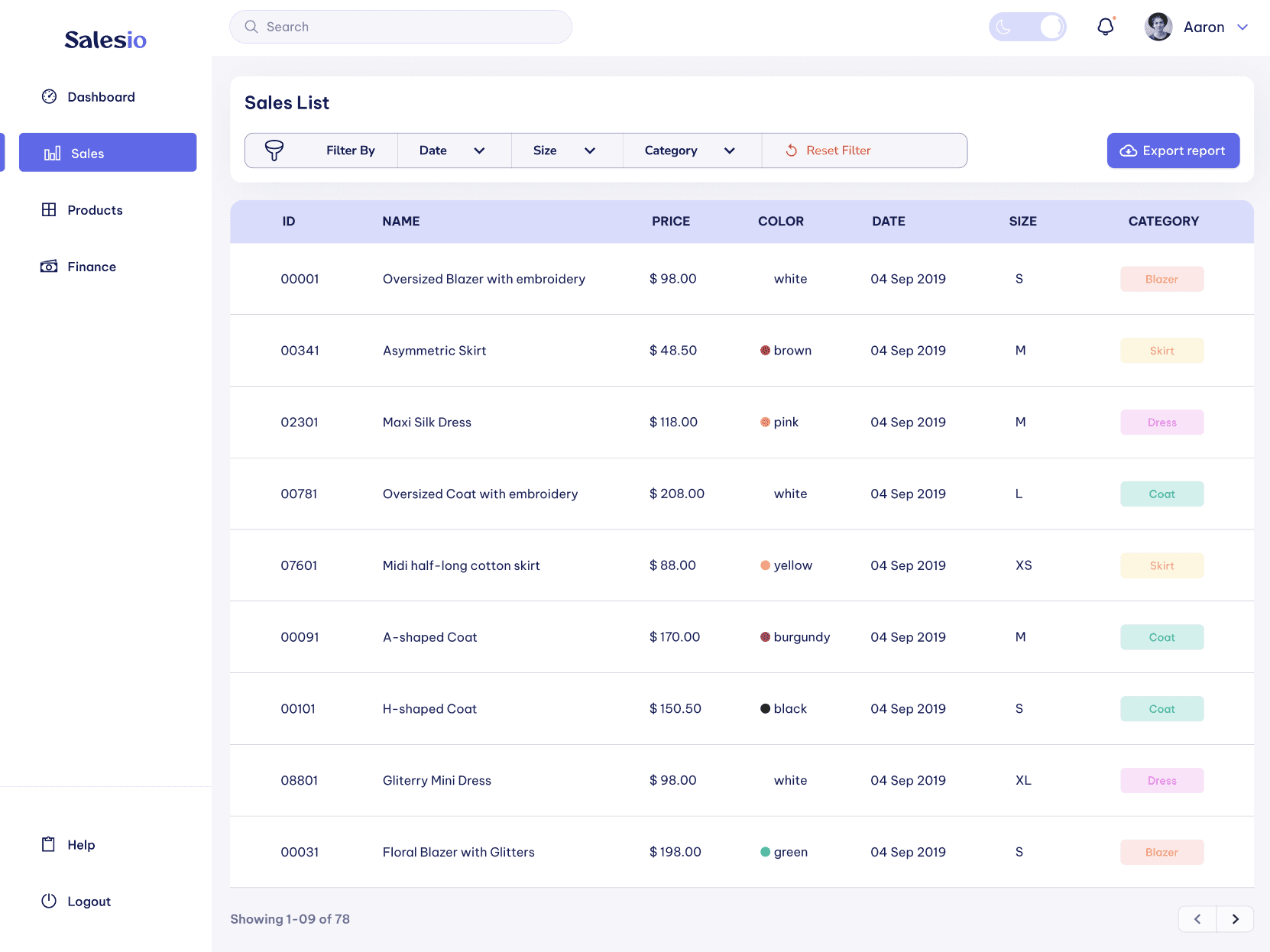
Product Stocking + Finance Management

06 outcome & results
By consolidating reporting into a single interactive dashboard organized around 4 daily decisions, the store manager reclaimed an estimated 2.5 hours per day previously spent on manual data analysis.
The full brand identity, logo, typography, and a unified light/dark design system, was delivered alongside the product, giving Salesio a launch-ready visual foundation.